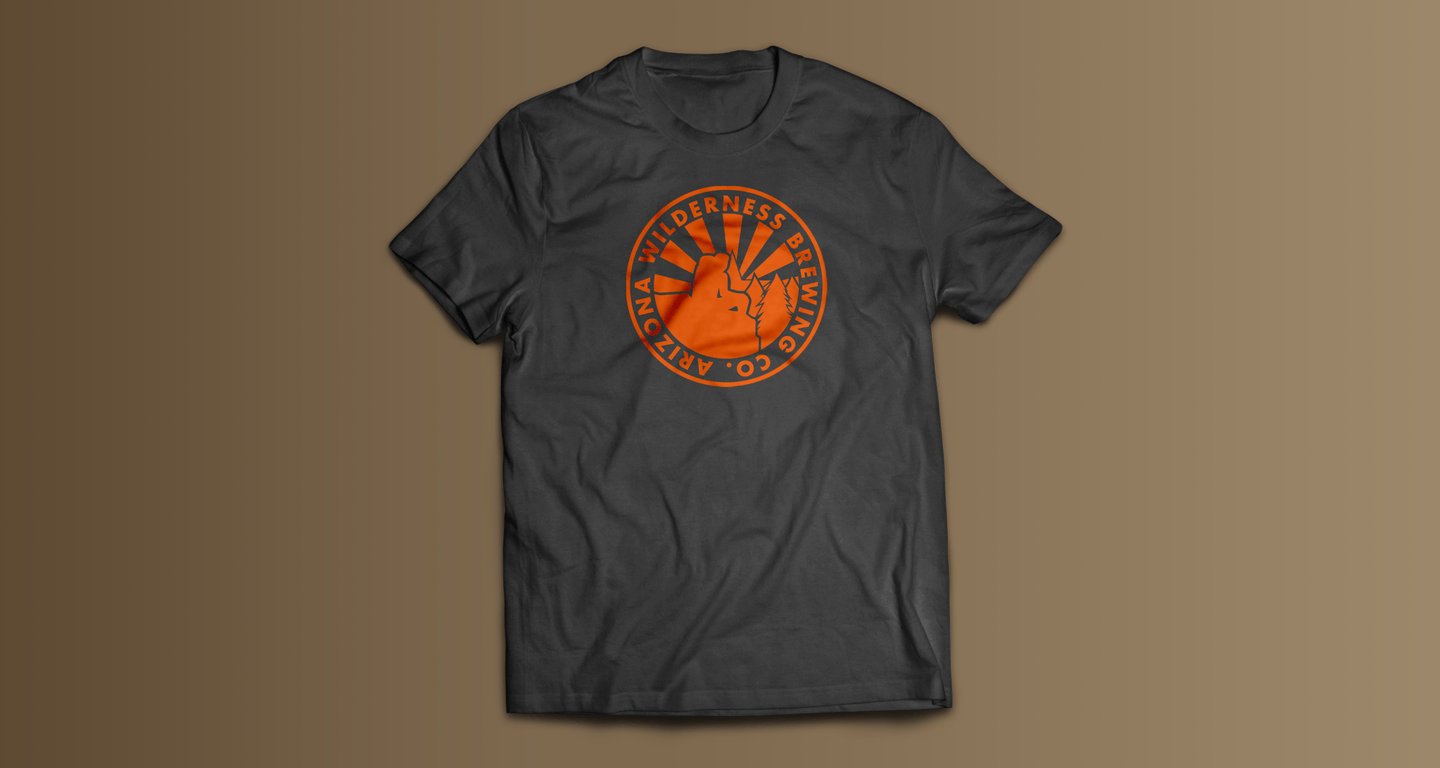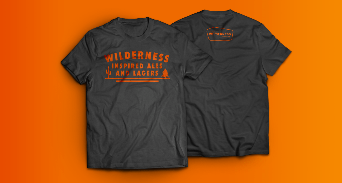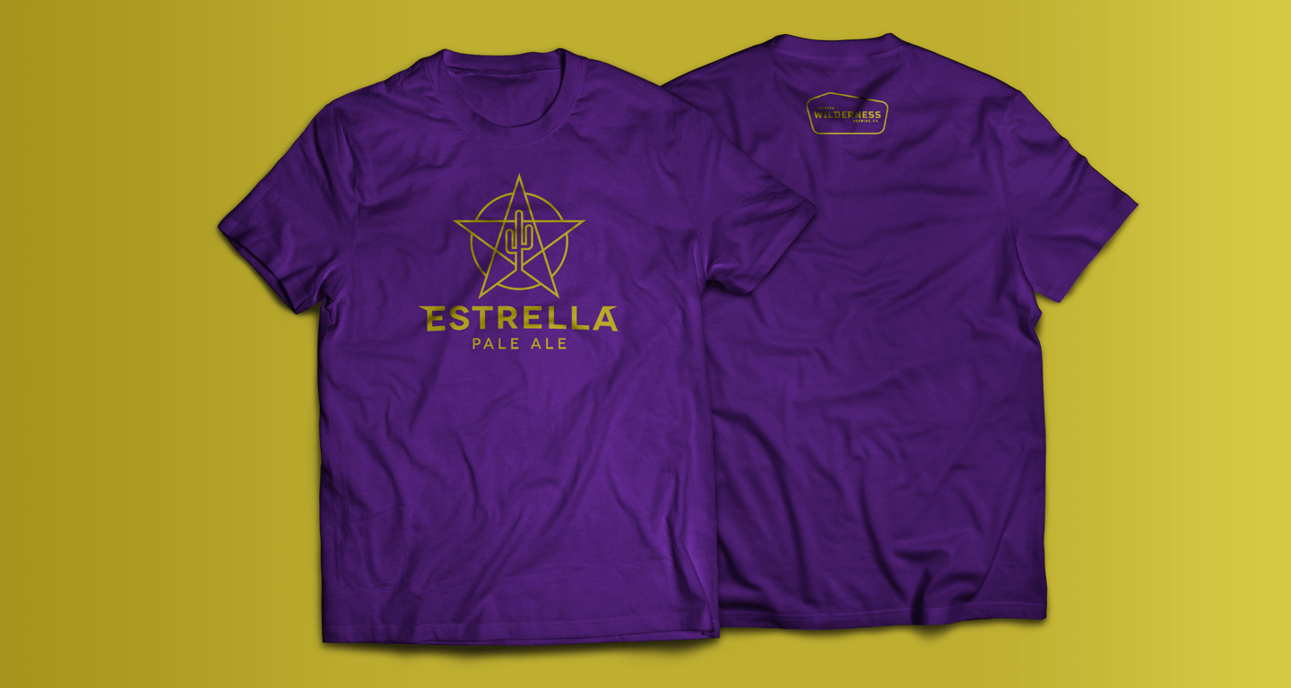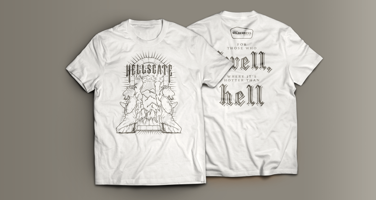
Photo credit: Jonathan Buford
Co-founder AZ Wilderness Brewing Co.
Branding and Print Design
Arizona Wilderness Brewing Co.
Dates:
2014-Present
Main Collaborators:
Jonathon Buford (Founder)
Patrick Ware (Founder)
AZW Marketing Team
My Role:
Concepting
Identity Design
Brand Standards
Print Collateral
This project began back in 2014, the craft beer scene was finally starting
to
gain
traction in
the Phoenix, AZ valley. At the time, the only existing craft breweries in the region
were
larger
production focused breweries, who didn’t dare to deviate from their core line-up of
beers.
From blistering deserts to lush forests and snow topped mountains, founders Jonathon
Buford
and
Patrick Ware were inspired by natures diversity to create a brewpub with just as
diverse
offerings. From traditional Ales, dry-hopped double IPA’s to Barrel Aged Stouts and
sour
beers,
Arizona Wilderness was one of the first breweries in the area to break the mold of
what
it
meant
to be a local brewery.
Their ethos goes beyond just their wide variety of beers though. Arizona Wilderness
is
all
about
Arizona First. They have made it their mission to source as much of their
ingredients in
both
their beers and their food from local Arizona farms and growers. From their use of
AZ
grown
grains from Sinagua Malt, to Arizona Grass Fed Beef and vegetables sourced from
local
farms.
Arizona Wilderness is all about keeping everything as interesting and diverse as the
beautiful
Wilderness areas in the state, and above all, keeping it local.
Primary Identity

The primary brand identity was inspired by the various wooden signs one can see in wilderness areas, across the US. Made of wood, they tend to have a bit of an unusual shape to them which makes them stand out. When I first consulted with the founders, they weren’t at the time putting too much thought into the importance of a well designed identity and how that relates to building their brand. The biggest challenge of their identity was in the length of the name. Initial variations included more details like wood grain, and other elements within the design. Eventually were able to work to a more simplified design which still contained the prominent odd shape of the actual Wilderness area signs.
Second Location Identity

After their 2014 award by Rate Beer, business exploded. They went from something like 15 employees to 60+ in what felt like over night. A few years later they expanded to a secondary location in Downtown Phoenix, which had a different business model. Due to this, they asked me to help design a secondary identity that still contained the same elements as the original, but made a clear distinction of the location.
Barrel Aged Products Identity

Along with their Downtown Phoenix location, they also opened a warehouse exclusively for their wild ales and Barrel Aged products. While this location is typically not open to the general public, it has been used for special events. Just as with the downtown Phoenix location, I was asked to create an identity for this location and for these products that had a bit more fo a high-end feel to it, as barrel aged products are typically more expensive.
Badges
Pattern Usage
Typography
Primary:

Secondary:

Primary Colors
PMS 4244 C
#7E694F
PMS 3564 C
#EF6A00
Being inspired by the wilderness, the goal was to invoke earth tones, but also keep the option to use a bright color to demand attention.
Secondary Colors
PMS 7687 C
#1D4289
PMS 193C
#bb133e
PMS 107 C
#fff22d
PMS 7566 C
#a96a31
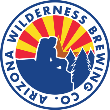
Due to the business's hyper focus on Arizona first ingredients, the AZ state flag colors were also employed a lot as secondary colors to emphasize locality. Particularly through the use of the badge / icon. These colors are meant to be use sparingly.
Tagline

Hospitality Touch Points
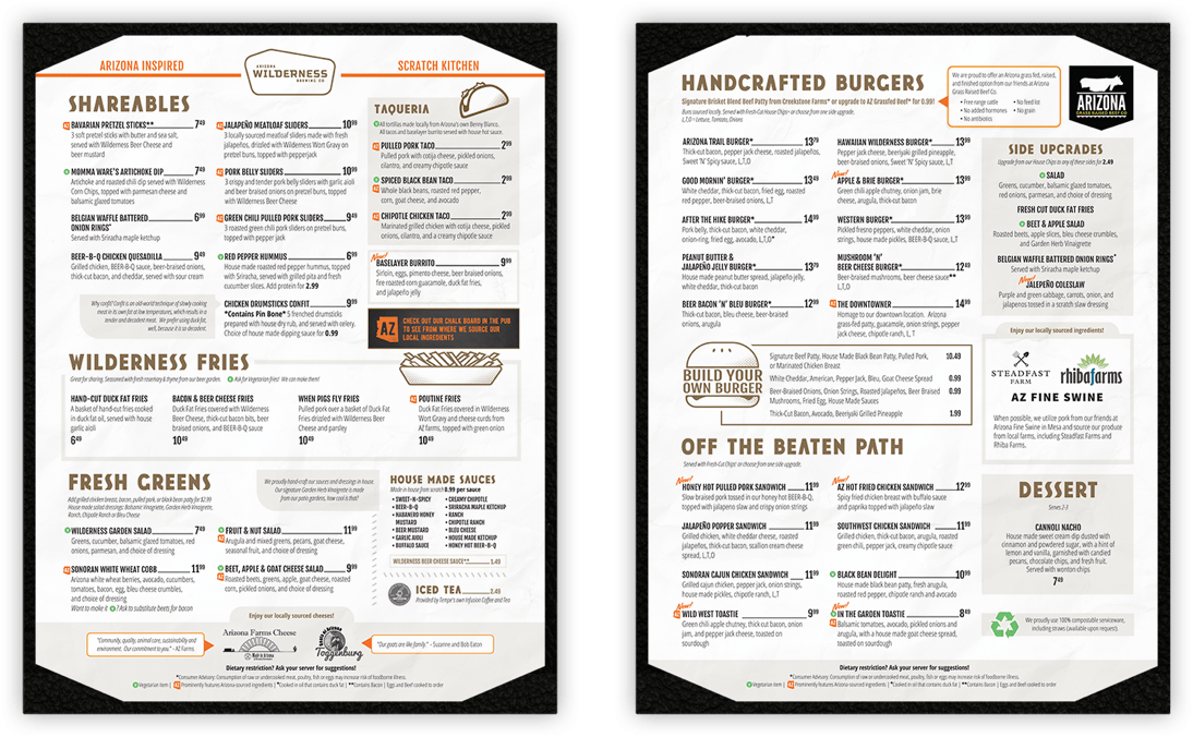
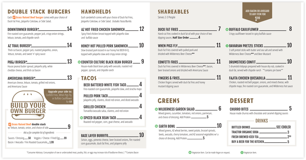
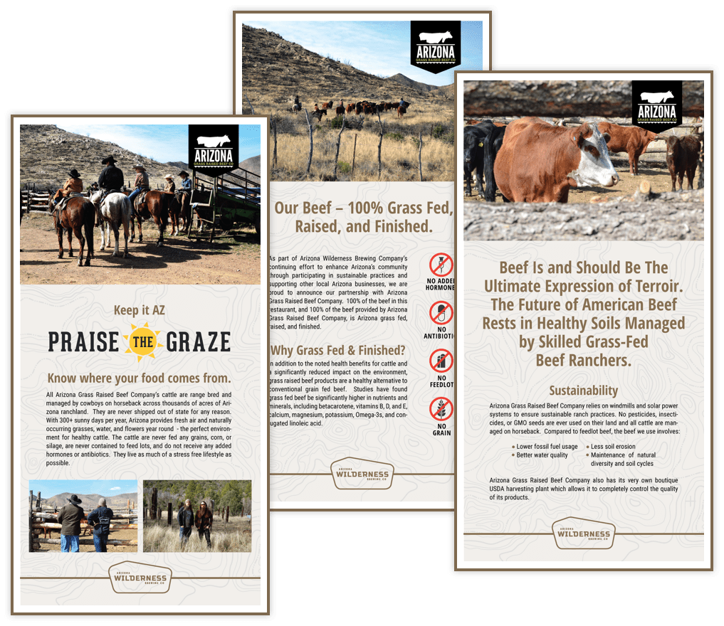
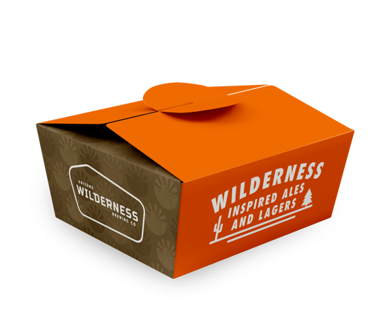
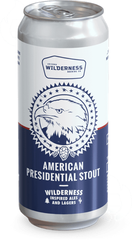
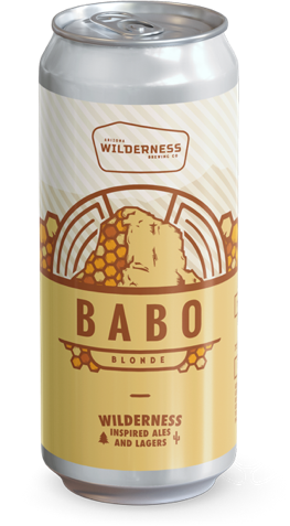
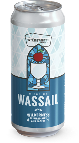
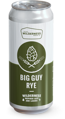
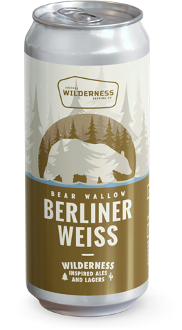
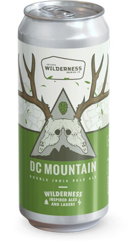
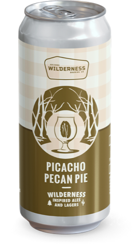
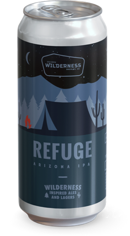
Mainstay Label Template
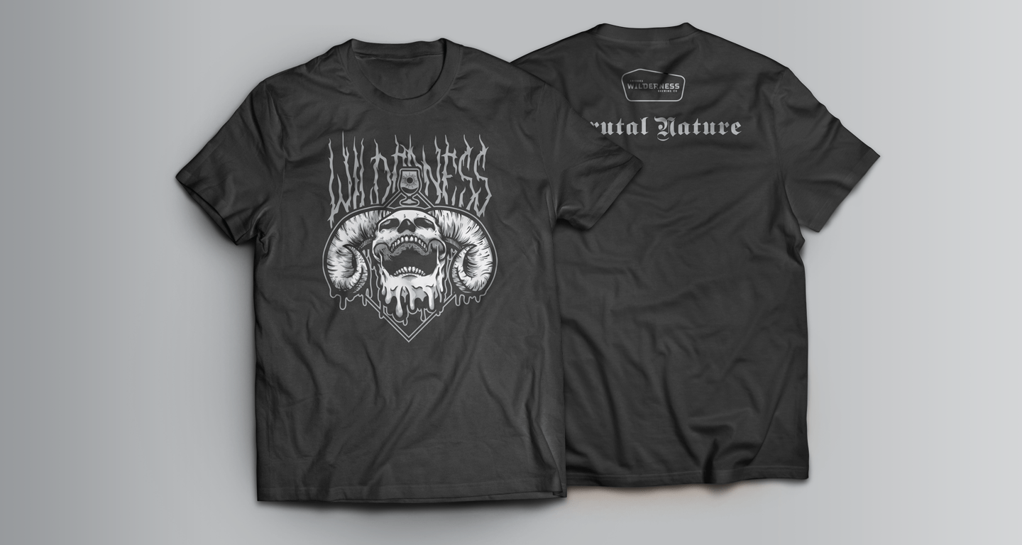
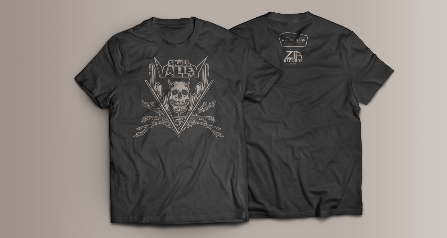
Merch
